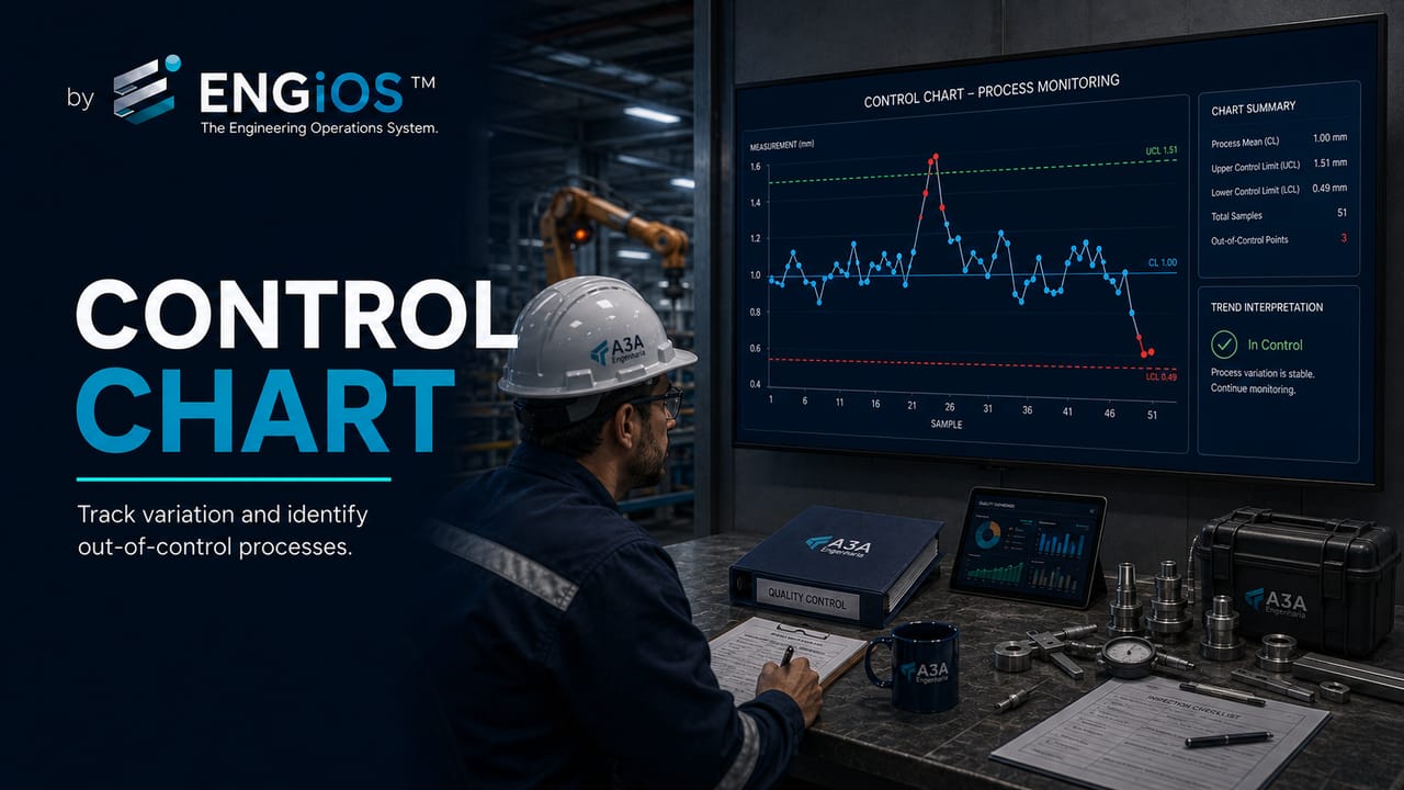
Understand how to use control charts in Engineering to distinguish common variation from special causes, interpret control limits, and decide when to investigate a process.
Check it out!
A control chart is a time-series graph used to distinguish the natural variation of a process from changes that indicate a special cause. It combines a center line with statistical control limits and, when properly used, helps decide when to investigate, when not to react, and when the process needs intervention. In Engineering, the tool is particularly useful for repetitive measurements, inspections, cycle times, document quality, manufacturing, commissioning, and other processes in which decisions based only on targets or on a single point can lead to incorrect conclusions.
The essential point is that a control limit is not a specification limit. The specification represents what is acceptable for the product, service, or requirement; control limits represent the observed statistical behavior of the process. A process may be statistically stable and still be incapable of meeting the specification, or it may temporarily meet the requirement while showing instability signals that anticipate a problem.
What Is a Control Chart?
A control chart — also called a Shewhart chart — organizes observations in time order and adds statistical references to assess process stability. In its basic form, it includes:
- a center line, normally associated with the mean or another reference statistic;
- an upper control limit (UCL);
- a lower control limit (LCL);
- the measured values over time or sampling sequence.
The logic is not simply to check whether a point is “high” or “low.” The purpose is to assess whether the observed pattern is compatible with the normal variation of the system or whether there is evidence of a change that deserves investigation.
This approach is directly connected to Statistical Process Control — SPC: the control chart is one of the main tools used to monitor process stability within an SPC strategy.
Why Is a Control Chart Different from an Ordinary Graph?
A line graph shows how data evolve. A control chart adds a decision model for variation.
In a simple graph, it is common to react to any fluctuation: if an indicator worsens in one measurement, someone changes the process; if it improves in the next measurement, the action is considered successful. This behavior can create over-adjustment, management rework, and new sources of variation.
With a control chart, the first question is whether the observed change is compatible with the historical variability of the process. Only then is it decided whether there is reason to search for a specific cause.
| Question | Trend graph | Control chart |
| Shows data over time | Yes | Yes |
| Has a center line | Optional | Yes |
| Uses statistical limits | Not necessarily | Yes |
| Distinguishes common and special causes | No | Yes |
| Supports investigation decisions | Limited | Yes |
| Can signal instability without a point beyond a limit | Generally no | Yes |
Common and Special Causes of Variation
Interpreting the chart depends on separating two types of variation.
Common causes are part of the system itself. They are small differences resulting from the normal combination of method, people, equipment, environment, information, measurement, and other process components. If only common causes are acting, behavior tends to remain statistically predictable within a range.
Special causes are events, conditions, or changes that do not belong to the normal pattern of the system. Examples include:
- supplier change;
- uncalibrated measurement instrument;
- procedure change;
- new team without adequate training;
- equipment failure;
- requirement change;
- a specific material lot;
- software or configuration change;
- exceptional approval congestion;
- atypical environmental or operating event.
The distinction changes the management response. A special cause calls for focused investigation. A common cause requires improving the system as a whole.
When variability stops looking random, the next step is not to rush into changing people or targets: it is to locate the change in the system, preserve evidence, and distinguish a special cause from a structural problem.
Center Line and Control Limits
The center line represents the reference behavior of the process. Depending on the chart, it may be the mean, median, a proportion, a count, or another statistic.
Control limits are calculated from the observed variability. In many classical charts, a range equivalent to approximately three standard deviations of the monitored statistic is used, although the specific formula depends on the data type and selected chart.
This means the limits must not be defined by opinion, target, or contractual tolerance. If someone arbitrarily chooses “±10%” because it seems reasonable, the graph may be useful as a dashboard, but it is not a statistically grounded control chart.
A Control Limit Is Not a Specification Limit
This is one of the most important sources of confusion in quality management.
Specification limits come from the requirement: drawing, contract, standard, acceptance criterion, expected performance, or customer need.
Control limits come from process behavior.
Consider a design or manufacturing dimension with a tolerance of 100 ± 5 mm. The specification accepts values between 95 and 105 mm. If the process historically fluctuates between 96 and 104 mm in a stable manner, it may be in control and, at that moment, meet the specification.
Now imagine that the chart shows a progressive upward trend, even though all points are still below 105 mm. The product continues to meet the requirement, but the process may be shifting. The chart allows action before a nonconformity occurs.
The reverse is also possible: a process may be extremely stable around 106 mm. In that case, it is statistically “in control” but systematically produces outside specification. Improving stability is not enough; the process level itself must change.
What Does It Mean for a Process to Be in Control?
A statistically controlled process shows sufficiently stable behavior for its variation to be explained predominantly by common causes. This does not mean a perfect process, a defect-free process, or necessarily a capable process.
Stability provides something essential: relative predictability. If the system remains structurally unchanged, it is expected to continue producing within a similar pattern.
The chart should be interpreted by observing both the limits and the randomness of the pattern. A set of points may be within the limits and still show an unlikely run, trend, level shift, or other nonrandom behavior.
Signals of an Out-of-Control Process
The best-known signal is a point beyond the UCL or LCL, but it is not the only one.
Depending on the rules adopted, the following may indicate a special cause:
- a point beyond the control limits;
- a long run of points on the same side of the center line;
- a continuous upward or downward trend;
- abnormal concentration near the center line;
- abnormal concentration near the limits;
- a cyclic pattern without an expected explanation;
- a sudden shift in level;
- a consistent increase or decrease in dispersion.
These signals need to be defined by the methodology used. It is not advisable to invent rules after looking at the chart merely to justify a desired conclusion.
Why Not React to Every Point That Gets Worse?
Because every process varies. If every fluctuation within the normal range leads to intervention, the intervention itself becomes a new source of instability.
Imagine the review time for Engineering documents. The stable history varies between 1.8 and 3.4 days, with a mean near 2.6 days. In one week, the value rises to 3.1 days. If there is no other special-cause signal, immediately changing priorities, replacing the team, or changing the workflow may be an overreaction.
Management must distinguish normal variation from significant change. This discipline is especially important when indicators are monitored in executive dashboards and there is pressure to react to every visual change.
The article Engineering Process Indicators explores the difference between measuring performance and understanding process behavior.
When Should Control Charts Be Used in Engineering?
The tool is appropriate when there is a measurable or countable characteristic observed repeatedly and in a meaningful sequence.
Manufacturing and inspection
It can monitor dimensions, torque, pressure, resistance, thickness, mass, concentration, test time, rejection rate, defect counts, and other characteristics.
Design engineering
It can be applied to administrative and knowledge-work processes, provided the operational definition is consistent. Examples include:
- document review lead time;
- number of returns per document batch;
- first-submission approval percentage;
- time between RFI and response;
- number of nonconformities per period;
- time to close outstanding items;
- rework rate by discipline.
Construction and commissioning
It can track repetitive test results, parameter stability, team performance, defect incidence, productivity, or release time for work fronts, provided data collection is sufficiently consistent.
Operation and maintenance
It can support monitoring of vibration, temperature, process quality, failures, service times, and other variables, respecting the nature of the data and the physical dynamics of the asset.
When Not to Use a Control Chart
The tool should not be applied mechanically to every indicator.
Avoid using it when:
- there are too few data points to establish a minimally reliable baseline;
- the indicator definition changes along the series;
- the points do not represent comparable observations;
- there is strong untreated time dependence;
- the data mix different processes without stratification;
- the event is unique and there is no meaningful repetition;
- the objective is only to verify compliance with a single specification;
- the system is undergoing continuous structural changes that invalidate the baseline.
In these situations, a trend graph, dispersion analysis, histogram, stratification, or another method may be more appropriate.
Types of Control Charts
Selection depends mainly on the data type and sampling method.
Variable data
These are numerical measurements on a continuous scale, such as temperature, dimension, time, mass, or pressure.
Some common charts are:
- X̄-R: subgroup mean and range;
- X̄-S: subgroup mean and standard deviation;
- I-MR: individual values and moving range.
The I-MR chart is often considered when there is one observation per period, a common situation in administrative or Engineering processes.
Attribute data
These represent counts or classifications, such as conforming/nonconforming, number of defects, or proportion of defective items.
Classical examples include:
- p: proportion of nonconforming units;
- np: number of nonconforming units when sample size is constant;
- c: number of nonconformities with constant opportunity;
- u: nonconformity rate when opportunity varies.
Choosing the wrong chart can generate inappropriate limits and false conclusions.
I-MR Charts in Engineering Processes
In many project-office processes, there is one aggregated value per period: the actual time for a delivery, the lead time of an analysis, the duration of an approval, or another individual measure.
In these cases, the Individuals chart (I) tracks each observation, while the Moving Range chart (MR) tracks the difference between consecutive observations. Together they help show both level shifts and changes in variability.
However, care is necessary: if each “point” represents a very different project type, the variability may reflect mixed populations rather than instability. Before using the chart, it may be necessary to stratify by discipline, complexity, client, phase, or another relevant characteristic.
Rational Subgroups: Why Does the Way Data Are Grouped Matter?
When there are several measurements per period, subgroups should be formed so that variation within the group mainly represents common causes, while differences between groups have a chance to reveal process changes.
This concept is more important than simply “having five samples.” If grouping indiscriminately mixes shifts, suppliers, methods, or different conditions, the chart may mask exactly the variation it should detect.
In Engineering, a subgroup could correspond to:
- parts from the same lot and manufacturing condition;
- measurements taken under the same configuration;
- documents from the same discipline and phase;
- inspections from the same work front or supplier;
- tests performed under the same operating condition.
How to Build a Control Chart Step by Step
1. Define the monitored characteristic
The metric must have a clear operational definition. “Design quality” is abstract. “Percentage of documents approved without blocking comments on the first submission” is measurable.
2. Confirm data comparability
Verify that unit, measurement method, population, frequency, and criteria are consistent.
3. Stratify when necessary
If clearly different processes exist, do not mix everything in one chart.
4. Select the chart type
The decision should consider variable or attribute data, subgroup size, frequency, and the nature of the distribution.
5. Establish the baseline
Use a representative period, avoiding the deliberate inclusion of abnormal conditions without analyzing them.
6. Calculate the center line and limits
The formula depends on the chart. Do not replace statistical limits with specifications or targets.
7. Plot data in time order
Time sequence is essential. Reordering the values destroys a central part of the information.
8. Apply signal rules
Define the criteria for detecting nonrandom behavior in advance.
9. Investigate special signals
When a signal appears, record the date, condition, change, probable cause, evidence, and action.
10. Reassess after a structural change
If the process is genuinely changed and stabilizes at a new level, the old limits may no longer represent reality.
A control chart is reliable only when the metric, process, sampling, and baseline represent the same system. If the data mix different disciplines, suppliers, or complexity levels, that problem must be addressed before the dashboard.
Example: Document Approval Time
Consider the time, in days, between submission and technical approval of documents in the same class. For several weeks, the process fluctuates stably between approximately two and four days.
At some point, a run of values above the center line appears, even without exceeding the upper control limit. The team identifies that a new approval step was informally added by an area that was not part of the original workflow.
The chart did not “prove” the cause. It signaled a change in behavior. The cause was confirmed through process analysis, records, and interviews. That is the correct use: statistics to indicate where to investigate, evidence to demonstrate the mechanism.
If the problem involves recurring governance and approvals, the diagnosis can be deepened through AS-IS and TO-BE process mapping and analysis of bottlenecks in Engineering processes.
Example: Nonconformity Rate
An organization tracks monthly the proportion of inspected items with nonconformities. If inspection volume varies each month, comparing only the absolute number of failures can be misleading.
A chart appropriate for proportions allows the denominator to be considered and verifies whether the rate remains compatible with the historical pattern.
If a special signal appears, the next step is not to conclude immediately that there is a “team failure.” Investigation may involve Nonconformity, 5 Whys, or a Root Cause Analysis — RCA, depending on criticality and complexity.
How to Investigate a Special-Cause Signal
The investigation should preserve the sequence of events. A robust routine includes:
- confirm the integrity of the data and measurement system;
- identify when the signal began;
- check for changes in method, people, materials, equipment, environment, or requirements;
- compare conditions before and after;
- stratify by relevant source;
- test hypotheses against evidence;
- define action proportional to the cause;
- monitor the chart after the intervention.
A hypothesis should not be accepted merely because it “makes sense.” The purpose is to relate the observed change to a real alteration in the system.
Control Chart and Histogram: Complementary Tools
The control chart preserves time order. The histogram emphasizes the distribution.
If a process mean changed over time, the aggregated histogram may show only a wide or bimodal distribution without revealing exactly when the change occurred. The control chart can show the point at which behavior shifted.
On the other hand, the histogram is better for visualizing skewness, concentration, tails, multiple modes, and overall dispersion.
For that reason, the two tools should be viewed as complementary rather than competing.
Control Chart and Pareto
The Pareto Chart mainly answers which categories concentrate the most occurrences or impact. The control chart answers how behavior evolves over time and whether there is a signal of a special change.
An organization can use Pareto to prioritize the main cause of design returns and then use a control chart to track whether the rate of that cause actually changed after corrective action.
Control Charts and DMAIC
In DMAIC, control charts may appear in different phases.
In Measure, they help understand stability and establish a baseline. In Analyze, they can reveal a behavior change associated with events or factors. In Control, they become a sustaining mechanism for identifying regression or special causes after improvement.
This is especially useful because a better mean after an action does not guarantee that the process will remain stable.
Common Errors When Using Control Charts
Using the specification as a control limit
This error turns the chart into a simple conformity graph and loses the statistical purpose.
Recalculating limits all the time
If limits are recalculated with every new point without a criterion, the change itself may be absorbed into the calculation and stop appearing as a signal.
Mixing different processes
Combining different disciplines, suppliers, products, or complexity levels can create artificial variability.
Excluding points without justification
A special point may be removed from the baseline only when the cause is identified and there is methodological justification. Deleting it because it “ruined the chart” compromises the analysis.
Confusing stability with capability
A stable process does not mean requirements are being met.
Using the chart without a reaction plan
Detecting a signal without defining who investigates it, within what time, and with what evidence turns the tool into decoration.
Reaction Plan: What to Do When a Signal Appears
An operational control chart should be linked to a reaction rule.
The plan may establish:
- who receives the alert;
- who validates the data;
- which conditions should be checked first;
- when to open a nonconformity or formal investigation;
- which records should be preserved;
- when production or the process should be stopped;
- who authorizes restart;
- how effectiveness will be monitored.
This connection between indicator and governance is what transforms the chart from a graph into a management tool.
Detecting a statistical signal is only the beginning. The organization must connect the alert to responsibilities, evidence, investigation, action, and effectiveness verification to turn monitoring into technical governance.
How to Use Control Charts in Nonindustrial Processes
Application in Engineering consulting, projects, and services is possible, but it requires greater care with data homogeneity.
Knowledge-work processes often have scope variability. A detailed substation design and a simple technical report review should not be treated as equivalent observations merely because both are “documents.”
Some strategies are:
- stratify by complexity class;
- separate discipline and phase;
- normalize by number of deliverables when technically justified;
- monitor rates, proportions, or lead times of comparable processes;
- document changes in policy, team, and tools.
The chart should represent a real process, not a convenient spreadsheet.
When Should Control Limits Be Recalculated?
Limits are not permanent. After a proven and stabilized structural change, it may be appropriate to establish a new baseline.
Examples include:
- a new TO-BE process has been implemented;
- equipment has been replaced;
- the inspection method has changed;
- a permanent technology change has occurred;
- standardization has reduced variability;
- capacity has changed consistently;
- a new approval policy has become established.
Recalculation should occur after confirming that a new system exists, not simply because uncomfortable points appeared.
How to Connect Control Charts to Executive Dashboards
A dashboard can show the main indicator, but the control chart adds statistical context for decision-making.
Instead of a traffic-light indicator that compares only the current month’s value against a target, management can visualize:
- current level;
- center line;
- control limits;
- special signals;
- annotations of relevant changes;
- investigation status;
- effect of implemented actions.
The Indicators, Dashboards, and Executive Reports solution can be structured so that performance interpretation does not depend only on isolated means and targets.
How Do You Know Whether the Chart Is Helping Management?
A good implementation should reduce impulsive decisions and increase the speed of identifying real changes.
Some signs of maturity are:
- fewer reactions to normal fluctuations;
- faster investigation of special causes;
- better distinction between systemic problems and localized events;
- decisions recorded based on data;
- periodic review of the baseline;
- connection between signals, actions, and effectiveness;
- integration with nonconformities, continuous improvement, and process management.
Final Considerations
A control chart is a decision tool for variability, not merely a graph with three lines. Its value appears when the organization preserves time sequence, selects the appropriate chart for the data type, distinguishes control limits from specifications, and establishes a clear plan for investigating special signals.
In Engineering, this discipline avoids two extremes: failing to react to a real change and changing the process because of a normal fluctuation. When integrated with SPC, DMAIC, cause analysis, indicators, and governance, the control chart becomes a robust mechanism for sustaining improvement and predictability.
Technical references
[1] NATIONAL INSTITUTE OF STANDARDS AND TECHNOLOGY (NIST). NIST/SEMATECH e-Handbook of Statistical Methods: What are Control Charts? Available at: https://www.itl.nist.gov/div898/handbook/pmc/section3/pmc31.htm
[2] AMERICAN SOCIETY FOR QUALITY (ASQ). Control Chart. Available at: https://asq.org/quality-resources/control-chart
[3] AMERICAN SOCIETY FOR QUALITY (ASQ). Statistical Process Control (SPC). Available at: https://asq.org/quality-resources/statistical-process-control
Frequently asked questions
It is a time-series graph with a center line and statistical control limits used to assess whether process variation is compatible with common causes or whether special-cause signals justify investigation.
Control limits are calculated from the statistical behavior of the process. Specification limits come from technical, contractual, regulatory, or customer requirements. A process may be stable and still fail to meet the specification.
Not necessarily. Nonrandom patterns, trends, or unlikely runs may also indicate a behavioral change even when all points remain between the limits.
An Individuals and Moving Range chart is commonly used when there is one observation per period or when rational subgroups cannot be formed, provided the data are comparable and the methodology is appropriate.
Yes. They can be used for lead time, approvals, rework, nonconformities, and other repetitive measures, provided there is a consistent operational definition, comparability, and sufficient data.
No. The chart signals changes and helps indicate when to investigate. Confirming the cause requires evidence and investigation methods such as 5 Whys, Ishikawa, or RCA depending on complexity.
Complementary technical materials
Related solutions
- Indicators, Dashboards, and Executive Reports
- Process Management, Workflows, and Technical Approvals
- Requirements, Evidence, and Acceptance Criteria Management
Related services
- Engineering Process Diagnosis and Optimization
- Technical Engineering Consulting
- Ongoing Engineering Consulting Services